Future Trends in Personal Dashboards for Daily Life
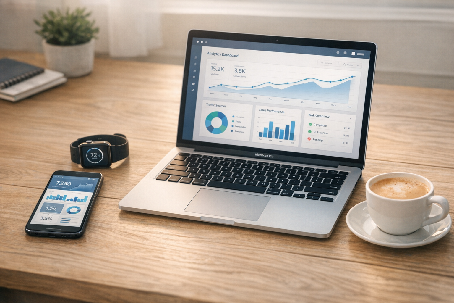
What if your dashboard could spot patterns before you do—sleep, spending, mood, and momentum all talking at once, until…
Future Trends in Personal Dashboards and Life Tracking Apps
Have you ever opened three different apps just to figure out why your day felt off? One app shows bad sleep, another shows high spending, and a third says your step count is fine. But none of them connect the dots. That's where the future trends in personal dashboards and life tracking apps start to feel genuinely useful, not just flashy. We're moving toward calmer systems that pull scattered signals into one view, then help you make clearer choices with less effort.
Where personal dashboards are heading next
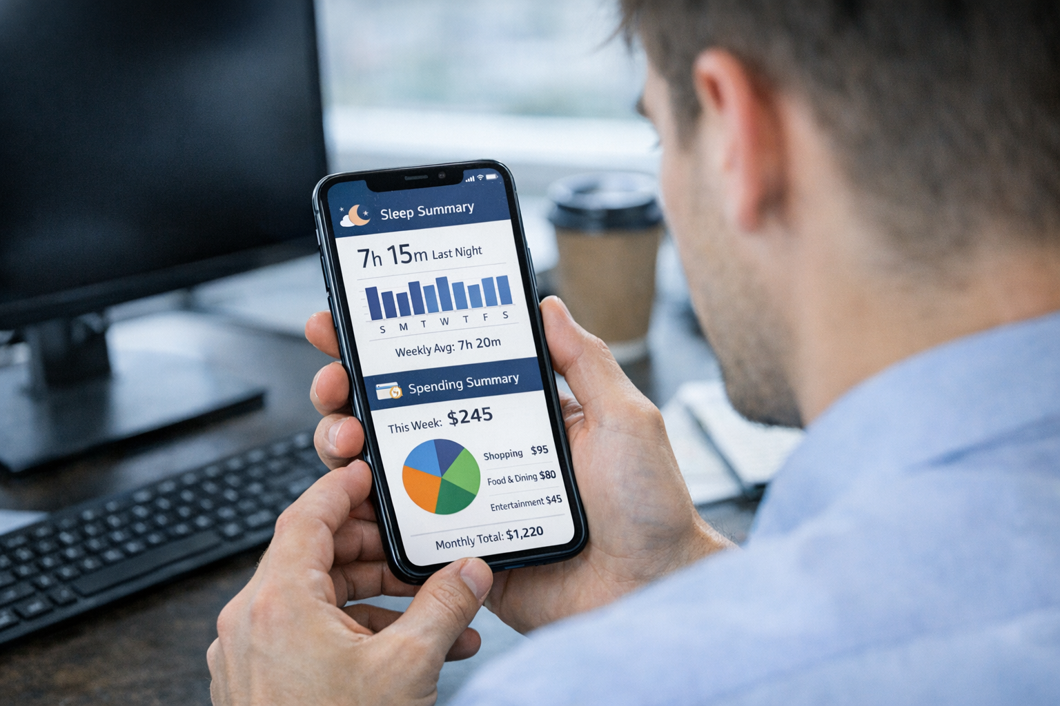
The short answer is this. The next wave of personal dashboards won't act like digital notebooks full of raw logs. They'll act more like personal operating systems for daily life. That means they won't just store your habits. They'll notice patterns, explain what changed, and suggest what matters now.
A future-ready dashboard might notice that your sleep dropped below 6.5 hours for three nights, your focus time fell 20 percent, and your coffee spending jumped. Instead of showing three separate charts, it gives you one calm recap. Maybe your week got more fragmented. Maybe your routine slipped after late workouts. That's the useful part.
And this is already starting. Wearables track sleep, heart rate, and movement in the background. Phones track screen time and location patterns. Finance apps track spending by category. The future trends in personal dashboards and life tracking apps bring those signals together across phone, watch, laptop, and tablet. You stop checking five places for answers.
The design is changing too. Less neon chaos. More quiet cards, simple trend lines, and views that match real life. Morning check-in. Weekly reset. Monthly review. Futuristic, yes. But practical first.
What a personal dashboard is in 2026, and how it differs from a basic tracker
In 2026, a personal dashboard is less like a single-purpose app and more like a smart control panel for your life. A basic habit tracker usually asks, did you do the thing or not. A mood app asks how you felt. A water app counts glasses. Useful, sure. But narrow.
A personal dashboard connects those pieces. It can pull in sleep hours, steps, mood scores, spending, focus time, hydration, and routine consistency, then show how they affect each other. So instead of seeing that your mood was lower on Tuesday, you might also see that sleep was under 6 hours, steps dropped below 4,000, and work sessions got cut into tiny chunks.
That context changes the whole experience. You're not staring at isolated logs anymore. You're seeing a pattern take shape.
Say your dashboard shows that on days with 7.5 hours of sleep, your focus blocks average 90 minutes and impulse spending drops by 15 percent. That tells you something real. It turns self-tracking into decision support. Not perfect truth, of course. But better guidance.
That's the biggest shift behind future trends in personal dashboards and life tracking apps. They combine signals into one surface that helps you decide what to adjust next, instead of simply proving that data exists.
The five major trends shaping life tracking apps

These shifts are coming from five clear forces, and they work best together, not alone.
- AI summaries turn raw logs into short daily or weekly recaps. Instead of reading six charts, you get a plain-language note like, "Your energy dipped midweek after two short-sleep nights."
- Predictive insights look for likely friction before it gets worse. A dashboard might warn that your routine consistency has fallen for 10 days, which often leads to lower mood scores the week after.
- Passive tracking reduces manual entry. Your watch, phone, smart scale, and even calendar feed data in automatically.
- Wearable integrations add body signals like resting heart rate, sleep stages, and recovery scores, often called readiness scores.
- Multimodal visualization makes data easier to read through cards, timelines, averages, and subtle alerts instead of wall-to-wall graphs.
AI summaries and predictive insights
This is where the category starts feeling less mechanical. AI summaries don't just repeat what happened. They interpret it. A weekly recap might say your best focus sessions happened after walks longer than 20 minutes, or that your mood tends to dip two days after poor sleep. That kind of connection is what most people actually want.
Predictive insight goes one step further. It spots risk early. If your sleep debt builds over 7 days and your calendar gets more crowded, the app might flag burnout risk or recommend a lighter goal target for the next 48 hours. That's not sci-fi. It's pattern matching with a human-friendly layer on top.
Passive tracking and wearable integrations
Manual logging gets old fast. That's why passive tracking matters so much. Your phone already knows screen time, movement, and often location history. A smartwatch can track steps, heart rate, sleep duration, and activity intensity. A connected budget app can track spending in real time.
When these tools sync well, the dashboard starts feeling almost invisible. You live your day, and the system quietly builds a map in the background. Then, when you check in, you see what changed without spending ten minutes entering numbers first.
Multimodal visualization
The best dashboards are getting calmer. Not emptier. Just clearer.
Instead of one giant graph, you might see a daily card, a weekly trend line, and a small anomaly marker that says your hydration fell below your usual range. Wait, let me clarify. Multimodal visualization simply means using more than one visual format so the data fits the question. Timelines are good for routines. Moving averages are good for trends. Cards are good for quick decisions.
That's a big part of the future trends in personal dashboards and life tracking apps. Better visuals aren't there to impress you. They're there to reduce mental noise.
How dashboards are becoming more contextual over time
A useful dashboard changes depending on whether you're looking at today, this week, or the last month. That's the contextual shift. One screen can't answer every question well.
A daily view should be fast. You want signals like sleep hours, steps so far, current spending, focus blocks completed, and maybe one gentle suggestion. If you slept 5.8 hours and your resting heart rate is 8 beats above your normal range, the app might suggest a lower-intensity plan for the day. That's context in action.
A weekly view is where trend lines start to matter. Instead of showing one bad night of sleep, it might show a 7-day average sliding from 7.4 hours to 6.6. That tells a very different story. The same goes for focus time. One great day means little. Seven days of decline means something.
Monthly views help with slower patterns like spending and routine consistency. A 30-day chart might show grocery costs rising 12 percent, or hydration staying below target on weekends only. And anomaly detection, which means spotting unusual changes, helps catch what your eyes might miss. Maybe your focus time suddenly jumps 40 percent. Good news, maybe. Or maybe it happened because you skipped breaks and sleep dropped after. The point is balance.
This is how dashboards get smarter without becoming louder. They meet you at the right zoom level.
Privacy, ownership, and the tradeoff between convenience and surveillance
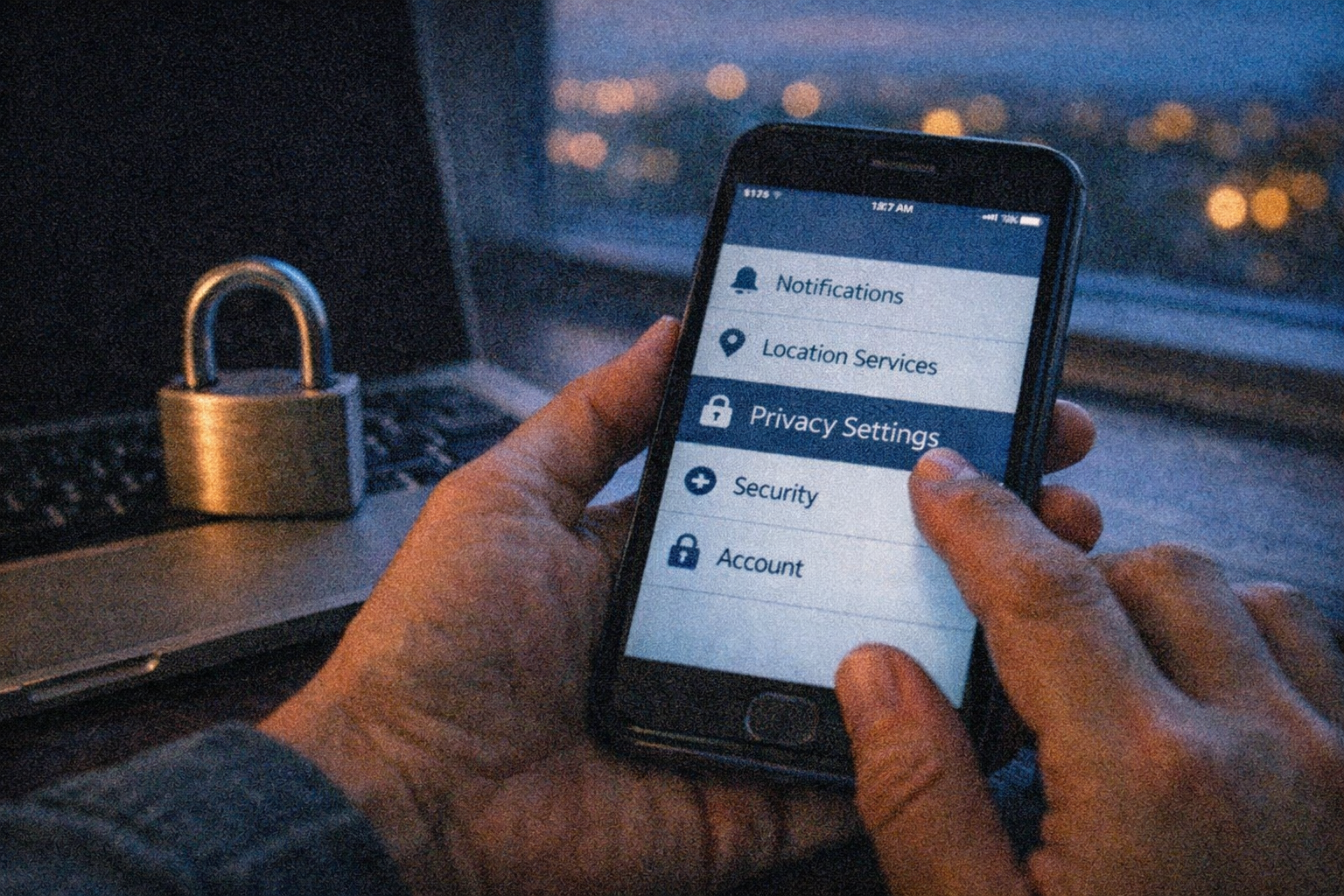
As dashboards collect more personal data, privacy stops being a side issue. It becomes part of the product. Sleep, mood, spending, location, heart rate, and routine history can reveal a lot about your life. Maybe more than many people realize.
The most trustworthy systems will lean toward local-first storage, which means your data stays on your device by default and only syncs out when you allow it. That's slower in some cases, and a bit less magical. But it reduces the feeling that your life is being piped into a black box somewhere far away.
A strong privacy setup should give you a few basic controls:
- Download your full data in a common format like CSV or JSON.
- Delete old records and revoke sensor access whenever you want.
- Choose what stays on-device and what syncs to the cloud.
That's the tradeoff. More convenience often means more centralized collection. More privacy can mean fewer cross-device features or slightly delayed processing. Still, for future trends in personal dashboards and life tracking apps, local-first design is becoming a real trust signal. If an app makes data export hard or permissions vague, that's not futuristic. That's friction wearing a shiny coat.
How to evaluate a future-facing dashboard so it stays clear and useful
A sleek interface can be seductive. But the better question is simple. Does this app help you make better decisions with less effort?
Start with manual work. If you have to enter 12 numbers every night, the system probably won't last. The strongest dashboards reduce input through passive tracking or smart defaults, then ask for human input only when it adds meaning, like mood or energy.
Next, ask whether the app shows trends you can act on. Not just pretty charts. Can you see that focus drops when sleep falls below 6.5 hours. Can you spot that spending spikes on low-energy days. Can you review today, this week, and this month without getting lost. That's where real value shows up.
Clarity matters just as much. If every screen throws ten metrics at you, you'll stop seeing anything. Good dashboards help you make fewer, better decisions. Maybe one daily adjustment, one weekly review, one monthly reset. That's enough.
The best systems don't try to measure your whole identity. They help you notice patterns, stay consistent, and course-correct with less friction. That's what future-facing should mean. Not more data. Better timing, better signals, and a calmer sense of control.
Final Words
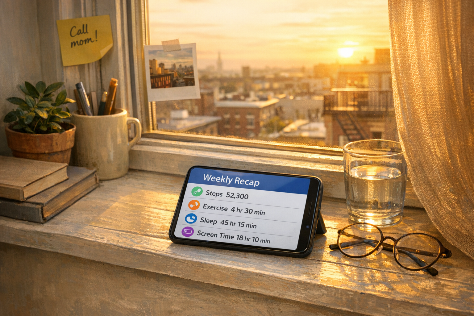
The clearest future trends in personal dashboards and life tracking apps point in one direction. Less clutter, more guidance. The best tools won't feel like cold data displays. They'll feel like calm personal operating systems that turn sleep, steps, mood, spending, and focus into choices you can actually use.
And that's the real promise here. More agency, not more noise.
As these systems get smarter, the winners will be the ones that stay readable, respectful, and grounded in daily life. Futuristic should feel clear in your hand, not confusing on your screen.
FAQ
What is the difference between a personal dashboard and a life tracking app?
A life tracking app usually records one or more metrics, like sleep or mood. A personal dashboard brings multiple signals into one view so you can spot patterns and make better decisions.
Which data types are most useful to track in a personal dashboard?
High-signal metrics usually include sleep hours, steps, mood scores, spending, focus time, hydration, and routine consistency. The best mix depends on your goals, so fewer meaningful metrics often work better than tracking everything.
How can life tracking apps stay useful without becoming overwhelming?
They stay useful by focusing on fewer metrics, clearer summaries, and daily, weekly, and monthly views. Gentle alerts and simple reviews help you notice patterns without turning the app into a second job.